If you have a business website started that doesn’t seem to be providing you with new customers or if you’re working on your website and want to make certain it performs as you want it to, you need to be sure the site is designed for conversion.
If it’s not, chances are your website is going to fail at what you most want it to do: make you money.
WHAT IS CONVERSION?
When you talk with someone about website design, you’re likely to hear the word conversion at least once.
The conversion rate is one of the most important statistics for a website . It’s the percentage of people who visit your website and convert into paying customers. Conversion doesn’t have to be about customers—it’s the percentage of your website visitors who sign up for a newsletter, follow you on social media, or take whatever action you want them to take.
However, for businesses, it’s about sales, so that’s what we’ll focus on.
It’s also one of the hardest statistics to measure in some cases. If you’re an online-only eCommerce site, your conversion rate is easy: all you have to do is calculate the percentage of unique purchasers to the number of unique visitors.
If you have a brick and mortar store or are a service, though, it’s not as easy.
You’re most likely doing other forms of marketing besides your website, so you may not always know why someone has walked into your store. Perhaps they did see your website and convert, or perhaps they saw one of your other ads. Either way, you gained a new customer.
However, it’s possible your conversion rate is actually higher than what you think it is.
Because it’s almost impossible to calculate, most businesses only look at online sales or bookings to determine their conversion rate, even though the true rate may be a little higher.
Here’s an example of conversion rate.
If 10,000 people visit your website during a month and 2,000 of them buy something, you have a good conversion rate of 20%.
DESIGNING FOR CONVERSION
Now that you have an idea of what conversion rate is, how do you design your website to increase it?
This has been the key question for website development experts for years. The key is to design your website as an experience that guides visitors towards your goal. This means employing tricks such as psychological nudges and persuasive design.
Here are some of the key elements of designing your website so that it improves your conversion rate.
USE LANDING PAGES

Landing pages are at the center of conversion design. Instead of having all of your traffic go to your homepage, you send traffic for certain keywords to different landing pages. For example, if you’re marketing your website to residents of more than one city or county, each are would have its own landing page. You would customize the content on that page for residents of each area. If your business had branches in Manchester, Birmingham, and Liverpool, you’d have three landing pages.
Each of these landing pages would be a standalone page, but all three would be working towards the same goal of converting visitors into customers. Each would provide information designed to convince visitors to fill out a form, click on the link to your eCommerce site, or take whatever other action you want.
Once that’s done, you’ve converted the visitor!
Of course, it’s not going to be easy, which is why having these landing pages isn’t enough. You have to use a few other tricks on these pages to convince your visitors to convert.
DRAWING THE EYE

Have you noticed on some websites that your eye is immediately drawn to a specific element?
This technique is called encapsulation, and the idea is to arrange everything on the landing page so that your eye immediately goes to the call to action. A single spot of contrasting color on a canvass will draw your eye right to it. By designing your webpage with a call to action that stands out from everything else, you’ll draw your visitors straight to that part of the landing page.
The converse of this is having a call to action that blends in with your page or that is somewhere out of the way where visitors don’t even see it. If someone on your landing page doesn’t notice what it is you’re trying to get them to do, your conversion rate is going to be abysmal.
Be sure your call to action stands out.
THINK ABOUT COLOR
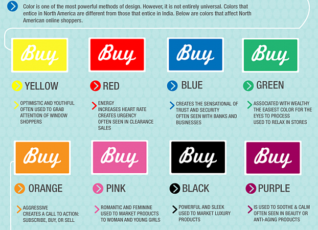
Color is one way of drawing the eye to your call to action.
If you’re using a white background with black text and other elements that aren’t really colorful, making your call a bright orange will definitely make it stand out. Of course, you do want to be careful with color—you don’t want to use color combinations that hurt the eye. Make sure your colors work well together.
People do associate some colors with certain feelings or actions. If you see something in bright red, for example, you may automatically assume that you need to stop or that something is dangerous. Green is often associated with go, thanks to traffic lights (at least for those in Europe). Pink is connected with girls, while blue is considered a masculine color. Keep all of this in mind when deciding what colors to use.
Also remember that contrast is often more important that going for bright, colorful elements. If most of your landing page is text, something like a large black button with some white space around it is going to stand out. That’s really the important element here—make your call stand out.
DIRECTIONAL SIGNS
Another way of directing people towards your call to action is to use elements that visually tell the reader where to look.
For example, a giant arrow pointing at your call to action would be a very obvious directional sign. You can be more subtle than that, of course, but sometimes using something very direct is the way to go. No one is going to be confused by a large arrow. Lines, boxes, and even white space can help direct visitors to your call.
White space is especially important. Many people feel like they need to cover all the space on a webpage, but white space can be very effective if used correctly.
MANY OTHER TECHNIQUES
These are just a few different techniques that experts use when designing a website for conversion. There are many more out there, of course. Using these techniques and design elements effectively will increase your conversion rate and your profits.
I hope that helped!
Damian
Need some of the same?
Interested in consultancy, advice or web development services? I'm available for hire to help you out with your next project!
Let's talk