The first issue of Web Design Inspiration
Creativity feeds on inspiration. I guess no one can be truly creative in the long term without a good portion of fresh ideas and new perspectives.
There is a huge pile of bookmarked sites sitting in my browser. I’ve decided to share with you with all my findings to hopefully give you some ideas about what’s fresh and trendy in web design.
All the websites published have been carefully hand picked for a reason. I’ll try to publish different styles, feels and looks and also stuffs from various places and not only the designs from the coolest industries.
Let me know if you like what you see!
1. Culture.pl (Multimedia Guides)
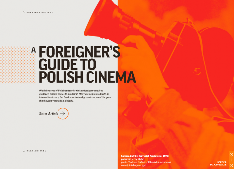
At the first glance this site looks very chaotic due to it’s unconventional layout, navigation and 100s of floating element. Although this might put someone off there is a time and place to apply this kind of approach.
You could tell that putting all of it together: music, typography and the actual information cost the team behind it quite a few drops of sweat (or blood?),
This website showcases few trends that emerged in 2016 and probably will be carried out across 2017 and beyond.
Breaking the rule of symmetry — layouts which are not perfectly balanced on the left and right sides
Open composition — Compositions of loosely suspended elements that are fleeing somewhere off-screen. Distribution of elements on the website gives the impression that it “exist” somewhere beyond the edge of the monitor.
Rich background and patterns — Heavy usage of patterns such as small dashes, stripes, or dots.Especially common is the grid pattern, which is treated as a “frame” for the other elements of the layout. Those elements are moved over the grid on the parallax principle and are arranged in a chaotic manner.
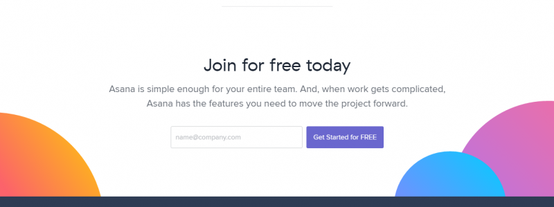
2. Asana.com
Asana is a collaboration tool similar to Slack or BaseCamp. Their website evolves very quickly and presents some good standards of modern corporate websites.
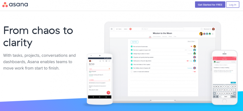
Information is chunked into digestible pieces and offered a good balance of positive and negative space. This creates a conforming, professional look and makes it a little easier to communicate what the company does and why you should be bothered checking it out.
Few things I appreciate it for:
Bold usage of colours and gradients — The era of flat design is starting to come to an end, maybe not all together but bit by bit. The biggest evidence of this is the new, up and coming trend of gradients. They are much more subtle than the gradients we used to see in web 2.0 era (1990) or after. Let’s be honest, gradients are in again!
As you can see gradients can be an interesting design decision; they help make these fun and exciting designs Happen. Overall, gradients are not bad – they never were – it’s just we got sick of them for being so extreme.
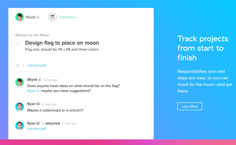
Breaking the horizontal layout — Creating unusual compositions (neither vertical nor horizontal) causes us the users to focus our attention a little more. It creates a dynamism and keeps us sharp.
Using simple tricks (such as SVG mask) to fake non-horizontal layout worked great for Asana.
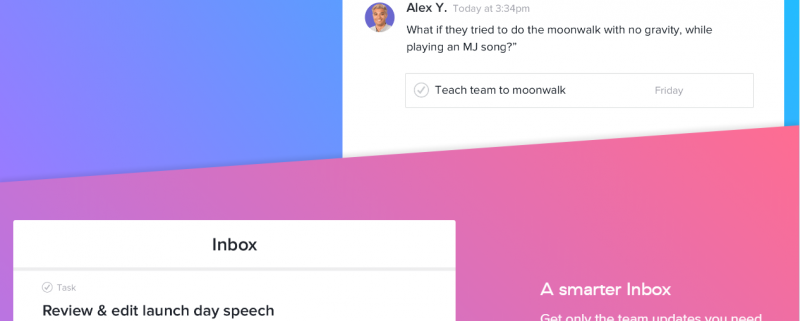
Using GIFS and Videos — Gif images are in high favour now. Animated gif not only grabs user attention (via motion) but helps to communicate better. This is important when your product is a little more complex.
Throwing in a video in autoplay mode to break up chunks of data is a great eye-catcher too! Nothing works better to surprise and make us stop for a while than a moving picture on the website.
3. Listener Playlist
Listener Playlist is actually a FWA website of the day winner.
Designed by Jiyong Ahn from Seoul, South Korea.
“This project started on facebook as a group called ‘Listeners Playlist’ where my friends shared their favourite music with one another. This inspired me to create an independent website where an archive with all the music that is shared in the group(…)”
Sleek and polished design and great tunes add up to a fantastic user experience. Although the whole composition looks very clean and simple, it’s very well thought and takes skill to get done right.
In addition, I could highlight the bold typography. It’s quite elegant and despite the fact I don’t like the hamburger menu, the design of that screen is quite beautiful.
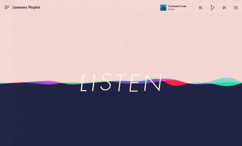
Another detail that adds a lot of value is the sound waves animation that divides the content. It was quite clever and adds those little moments of delight that captivates user’s attention.
How websites are picked?
In the examples above, you’ve seen many of these best practices applied effectively in order to maintain an enjoyable, friction-free experience.
As the last thing I wanted to quickly round-up what makes a good website in my opinion.
Designing a good website is a tricky balancing act to pull off.
Does one attempt to present the user with all the information in a clean, organized manner, or reveal it bit-by-bit, in an effort to create an engaging breadcrumb trail that tugs the user along the road to enlightenment?
Get it wrong, and you risk overwhelming your visitors, who’ll then leave without retaining any part of what they just read.
Get it right, though, and you’ll have gained a new audience member who not only understands your message, but also might just bring a few friends with them when they return.
A short note on Web Deesign principles
In my online travels, I’ve identified several tools and principles that should live in every designers’ utility belt. They can be used to attack the challenge of creating good looking and performing website:
- White space – allowing the content (and your visitors’ eyes) room to breathe
- Boxes, borders & graphical planes – Segmenting the information into visual categories
- An intuitive search method – Letting your users jump straight to the info they need
- Grids – Although not always necessary for comprehension, keeping content within a rigid, consistent structure helps reduce the effort required to process it
- Strong information hierarchy – Establishing a consistent design language using content types (blurbs, excerpts, call to actions)
- Visual hierarchy – The relative importance of different content areas and elements can be visually implied in many ways, ranging from typographic treatments (headlines, sub-headings, pull-quotes, etc.), to image sizes and saturation, placement, etc.
These are the key points that I based my decisions on when picking good looking websites.
That’s it for now!
I hoped you liked it (I guess so If you came down that far..)!
The next batch of inspiration is on it’s way.
Cheers,
Damian
Free website audit
Check how is your website performing. Find out about broken links. Boost your SEO ranking. Receive an actionable feedback to your email!
Check my website